THE COMPANY
PROJECT
ZimmRose is a retail advisory helping consumer brands navigate launching and growing with clarity, experience and a distinctly human point of view.
Brand Identity
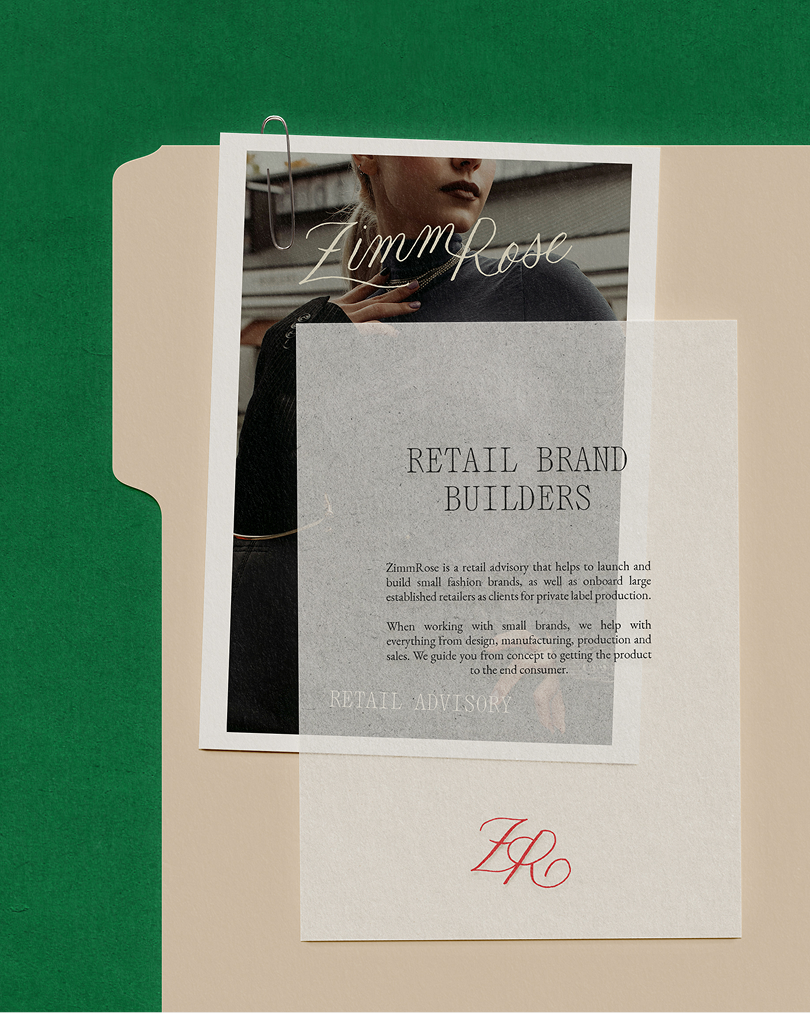
Collateral
Website Design
THE BRIEF
Our goal was to create an identity that reflects what makes ZimmRose unique: decades of retail experience paired with a fresh, highly personal approach to helping consumer brands grow. The brand needed to feel established and credible without becoming overly corporate—balancing heritage, confidence and polish with warmth, personality and a little unexpected charm.
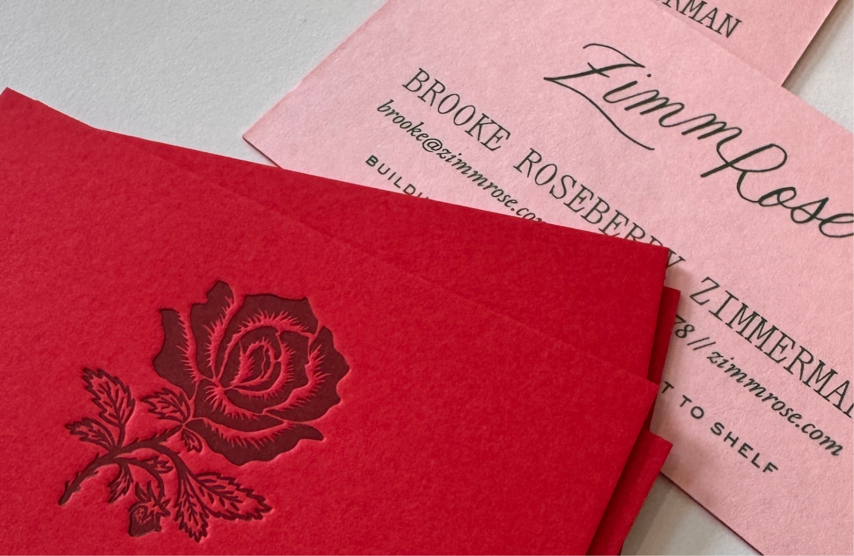
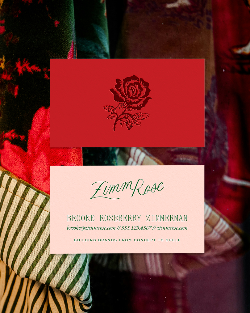
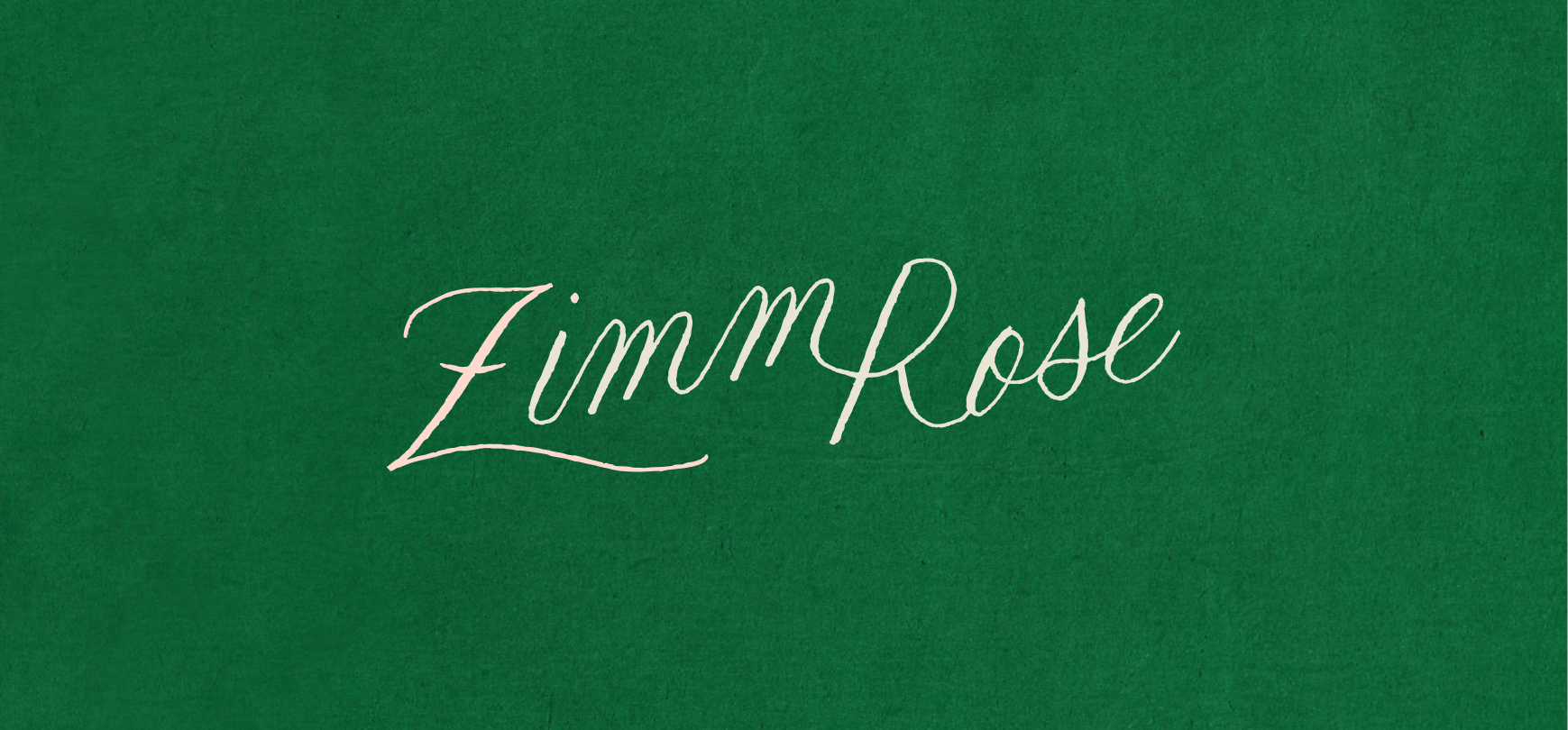
The visual identity takes cues from the Roseberry family’s history in business, including Brooke’s father’s original business card, while reinterpreting those references in a distinctly modern way. Expressive typography, an offbeat color palette and playful details create a brand that feels rooted in legacy but very much forward-moving.
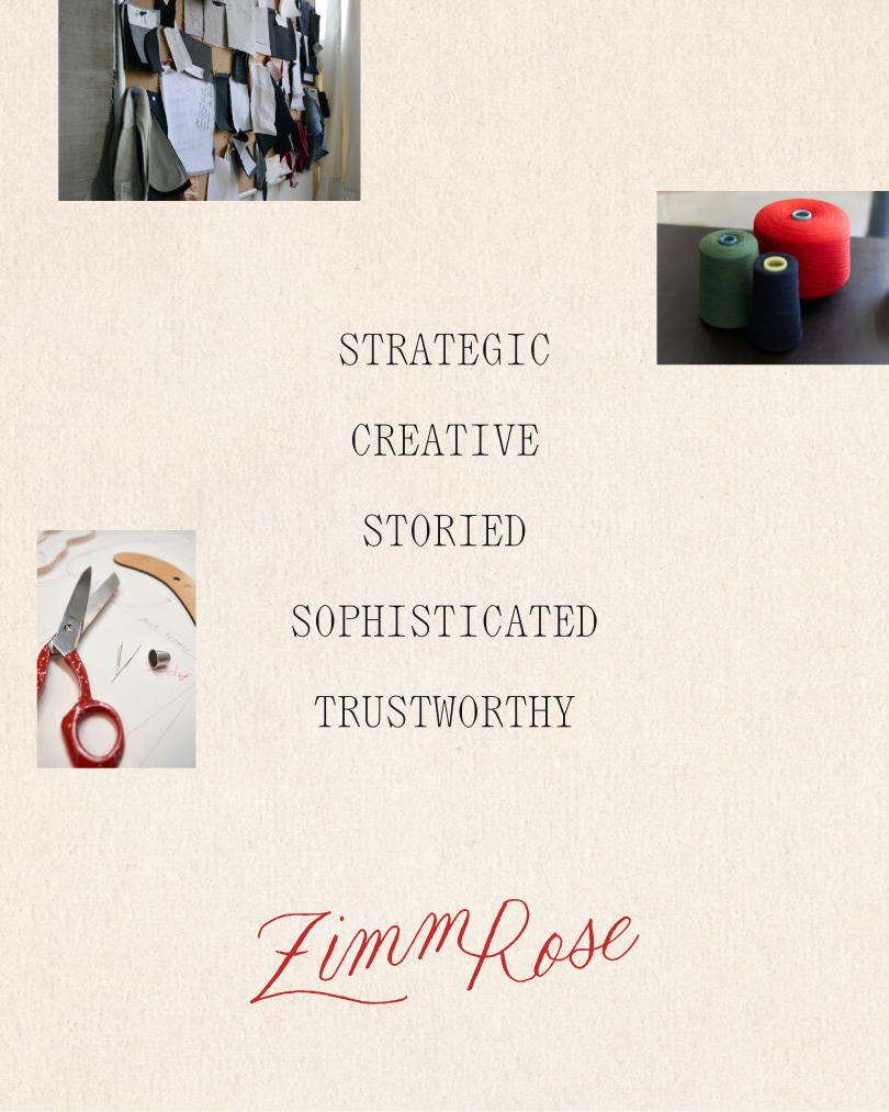
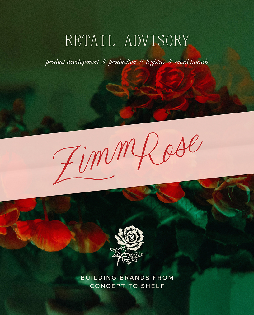
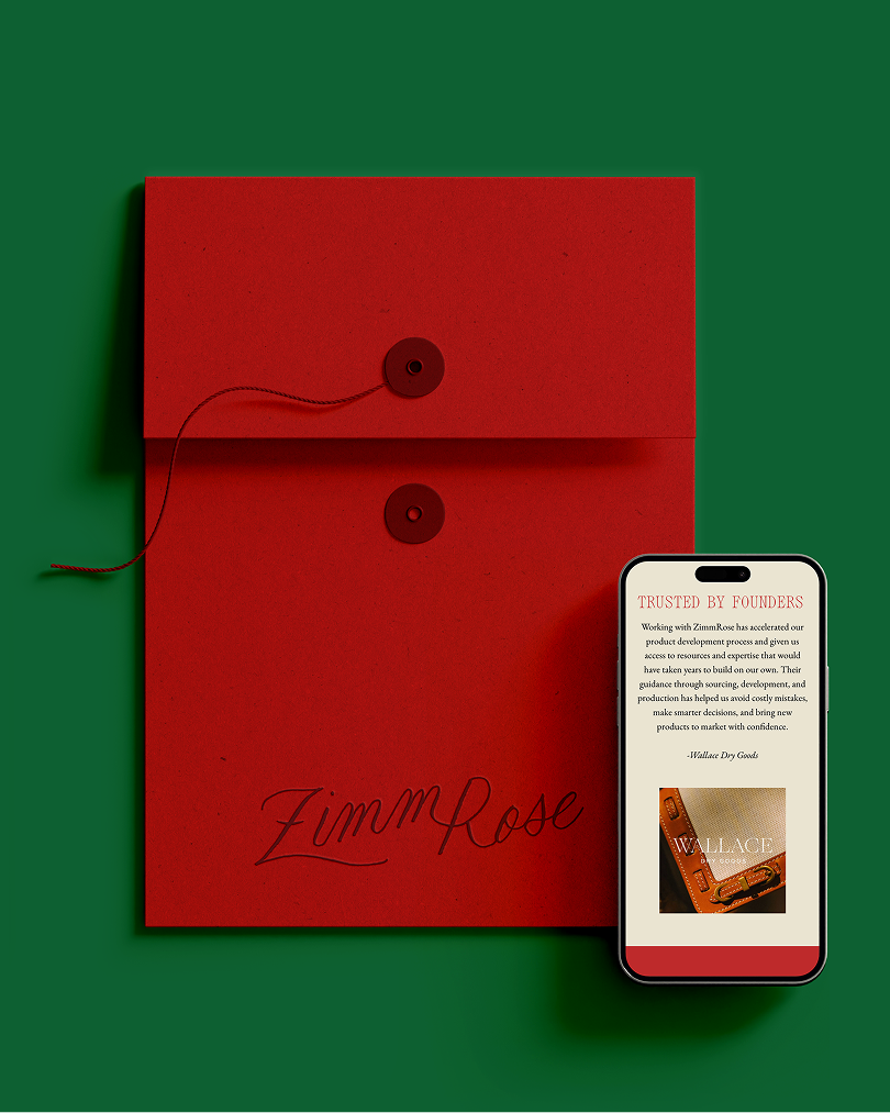
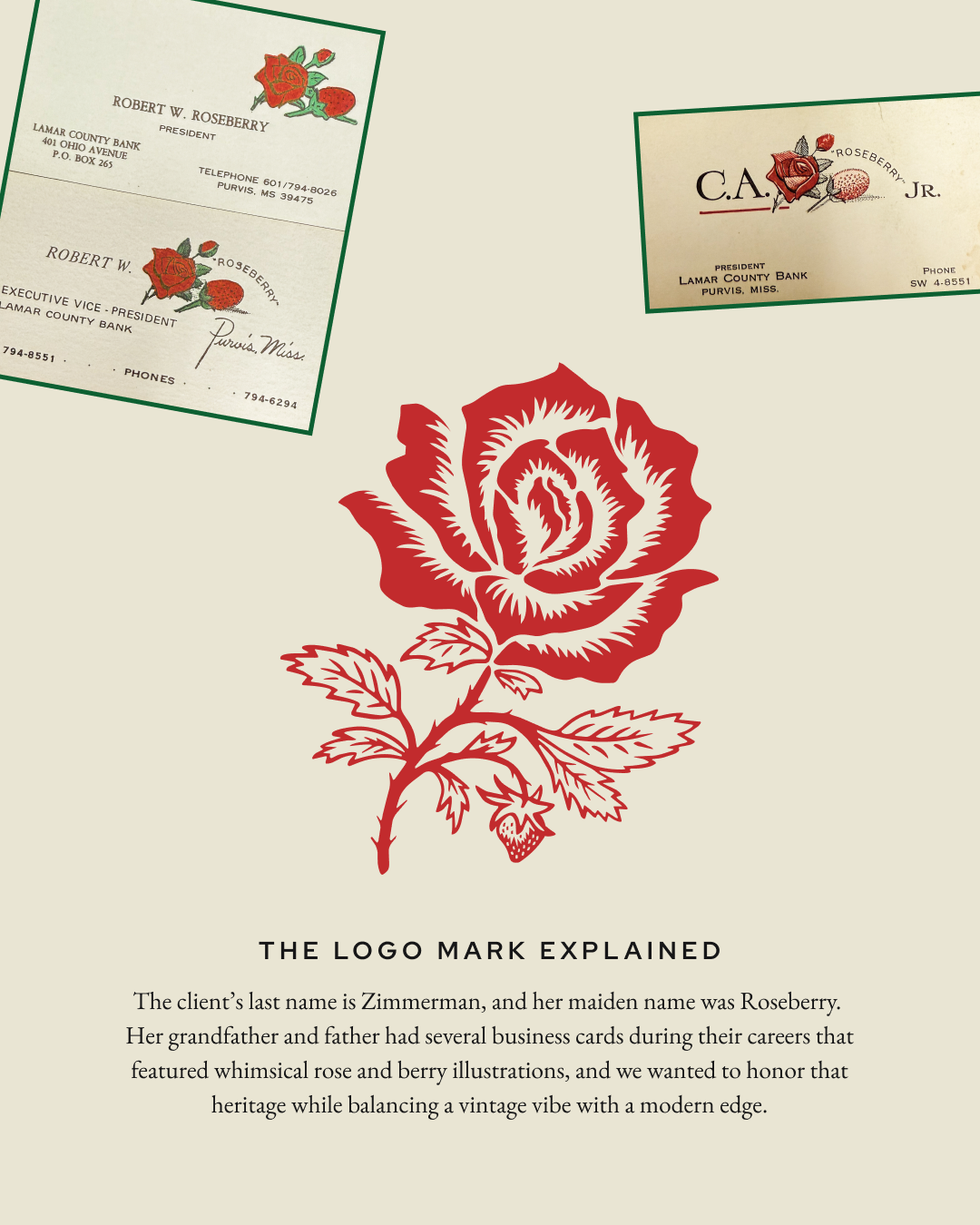
At the heart of the identity is a custom rose mark inspired by the rose found on Brooke’s father’s original Roseberry business card—a small piece of family history given a new life within ZimmRose. We paired it with an unexpected strawberry detail, expressive typography and tactile, fashion-inspired applications that keep the brand from feeling too traditional or expected.
The result is a visual language that feels collected rather than overly coordinated: confident, colorful and full of character, with enough polish to reflect the caliber of ZimmRose’s work and enough personality to feel unmistakably their own.