A blue background with a decorative floral border frames the “ElizaGrace Paperie” logo in white script and sans-serif type.

THE COMPANY

PROJECT

Kris Middleton Interiors designs homes that feel both deeply personal and effortlessly elevated throughout the Dallas–Fort Worth area. By weaving her clients’ stories into each design and layering in unexpected moments of intrigue, Kris transforms spaces into timeless reflections of the people who live in them.

Brand Identity
Collateral
Website Design

THE BRIEF

Our goal for this project was to design a brand that mirrors Kris Middleton’s interior design philosophy—collected yet refined, elevated yet approachable, classic yet modern. It’s a thoughtful balance where contrasting styles come together in harmony, much like the homes she creates. We achieved this by pairing unexpected fonts and a hand-drawn logotype with unique textures, patterns, and colors that feel simultaneously vintage and modern. The entire logo suite carries this sensibility forward, combining delicate details with organic, imperfect forms. And the turquoise stone, subtly scattered throughout, adds a touch of surprise—quiet yet striking, leaving a signature impression wherever it appears.
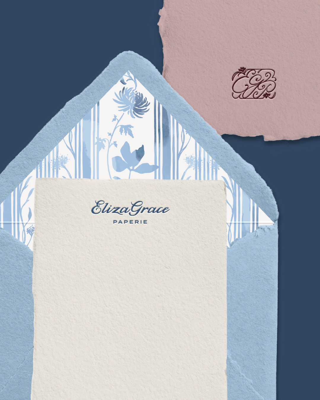
A light blue envelope with a floral liner sits partially open, revealing a cream sheet printed with “Eliza Grace Paperie,” with a mauve monogrammed paper in the corner.
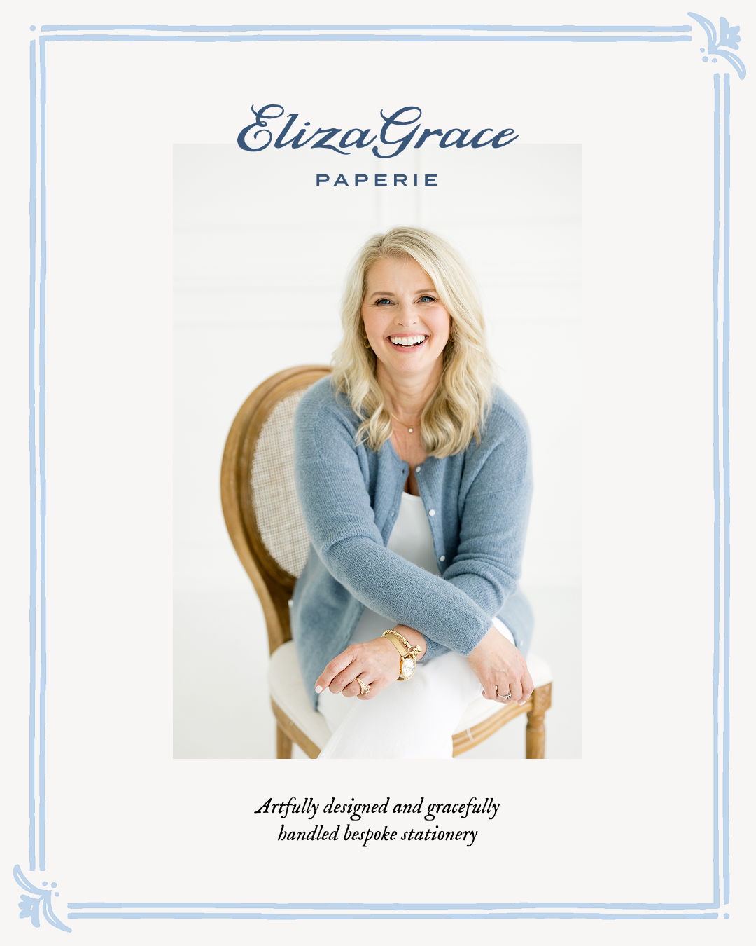
A portrait of a person seated on a wooden chair wearing a soft blue cardigan and white outfit, framed with blue flourishes and featuring the Eliza Grace Paperie logo and tagline.
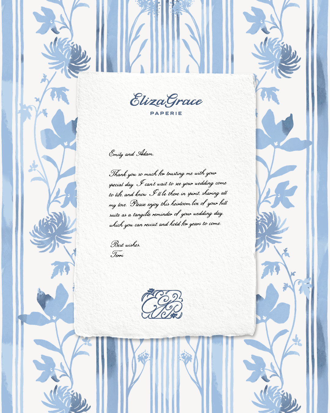
A printed letter on textured paper featuring the “Eliza Grace Paperie” logo at the top, placed on a blue-and-white floral patterned background. The letter includes a heartfelt message expressing gratitude and well wishes.
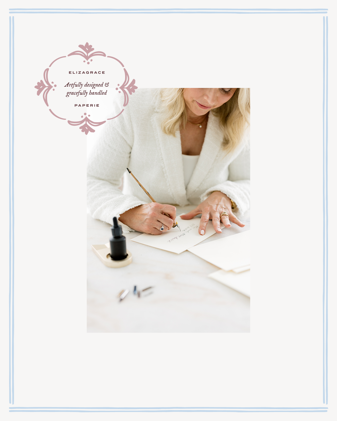
A person in a white textured jacket writes with a dip pen at a table, with ink bottles nearby and an ElizaGrace Paperie emblem in the corner.

The Kris Middleton Interiors website extends the brand’s layered, tactile aesthetic into the digital space. We carried the brand elements through with the same unexpected fonts and rich color palette, incorporating real paper textures wherever possible to evoke warmth and authenticity. Hand-drawn flourishes, intricate patterns, and Polaroid-style image frames add depth and a sense of tangibility, creating an intriguing experience that mirrors the thoughtful, elevated interiors Kris designs.
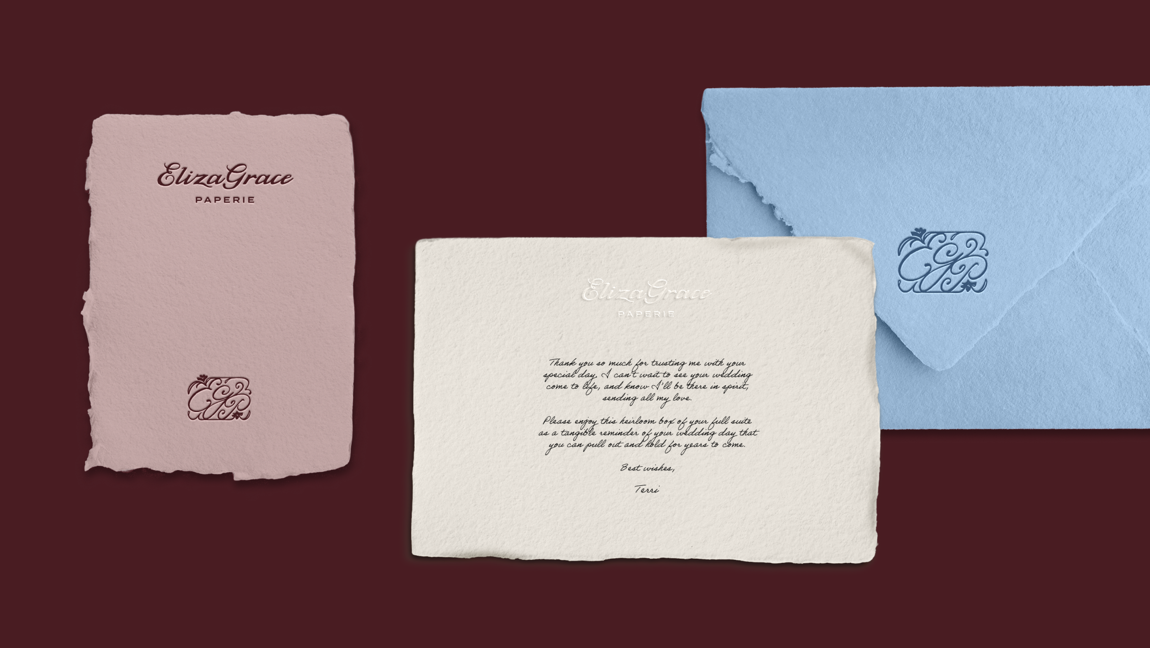
A pink card, cream card, and light blue envelope arranged on a maroon background, each featuring ElizaGrace Paperie branding and matching monograms.
A close-up of a textured blue envelope with its flap partially open, showcasing an embossed decorative monogram made of ornate swirls and flourishes.
A minimalist graphic with light blue vertical stripes and a decorative flourish centered above text describing a boutique design house for sentimental couples. The “ElizaGrace Paperie” logo appears below in script and sans-serif fonts.
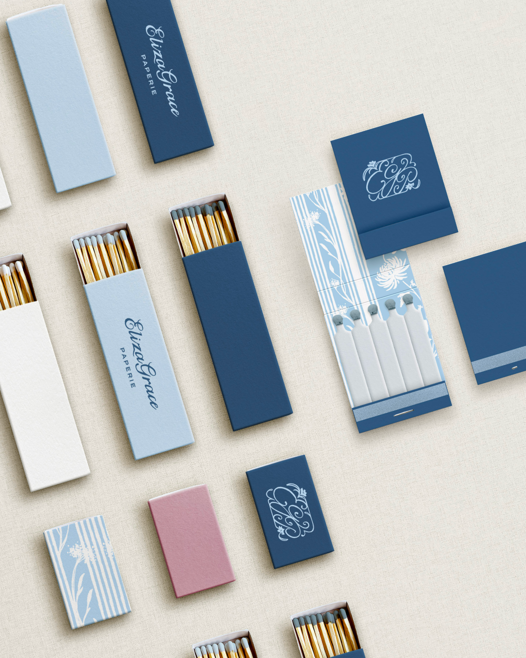
An arrangement of matchboxes and matchbooks in shades of blue, white, and pink, each featuring refined designs and “Eliza Grace Paperie” branding. Some boxes are open, revealing wooden matches with colored tips.
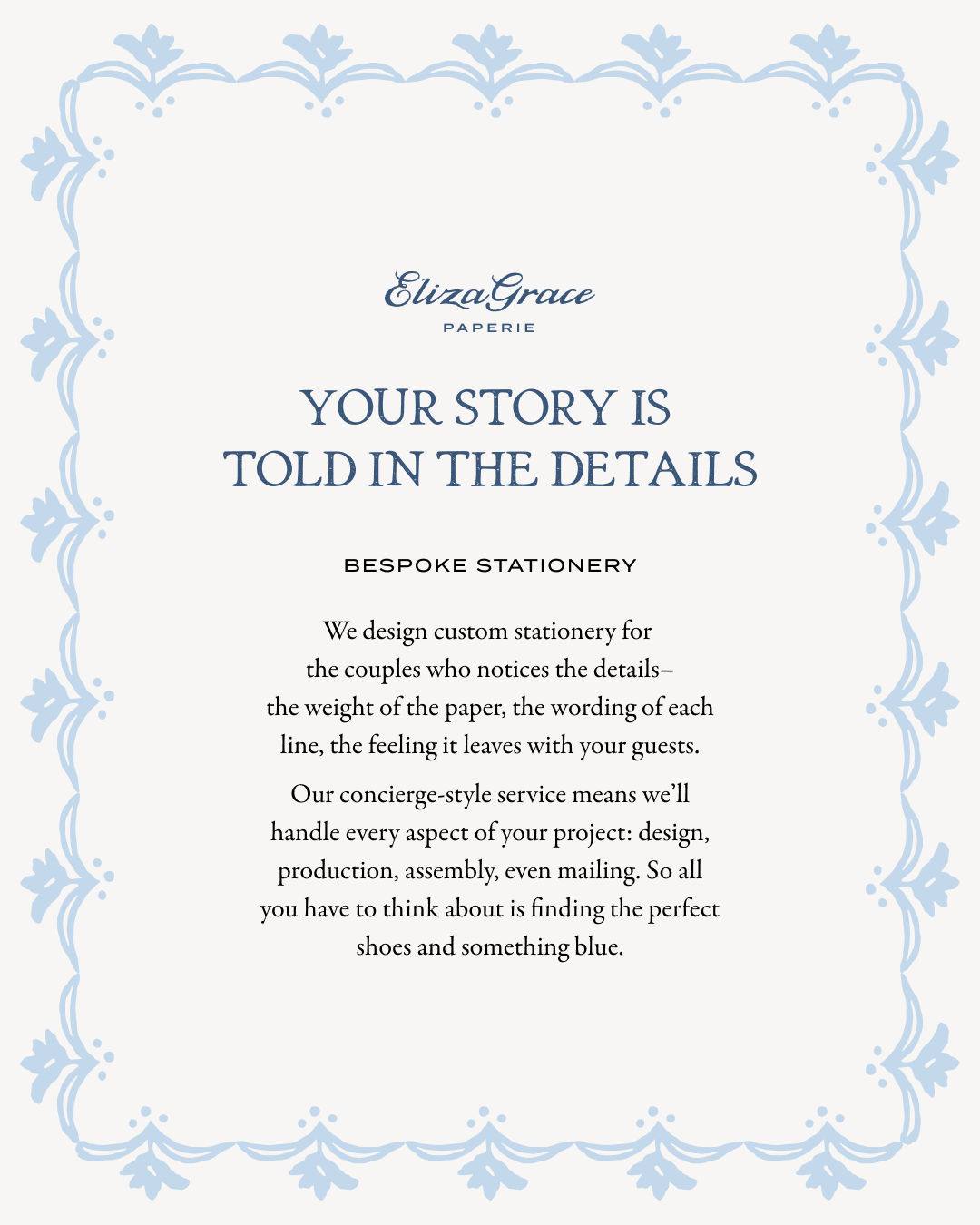
A promotional flyer with an ornate light blue floral border surrounding centered text describing bespoke stationery services. The “ElizaGrace Paperie” logo appears at the top.
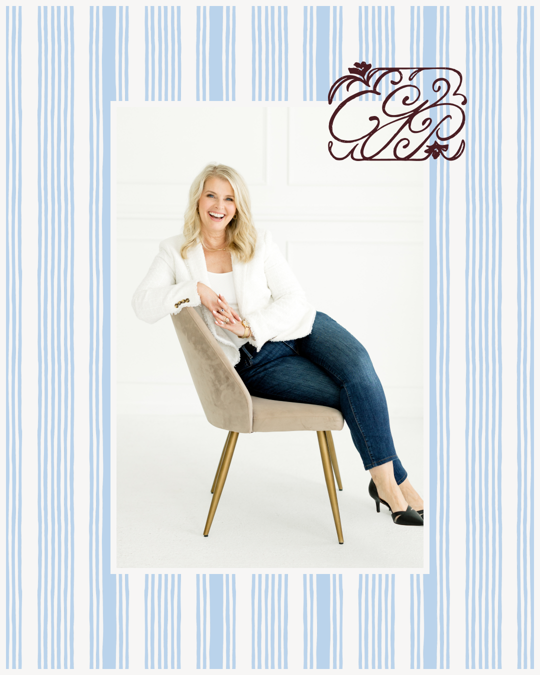
A person seated on a beige chair in a bright white room, wearing a white textured blazer, dark jeans, and black heels. A decorative monogram appears in the upper corner against a striped blue border.
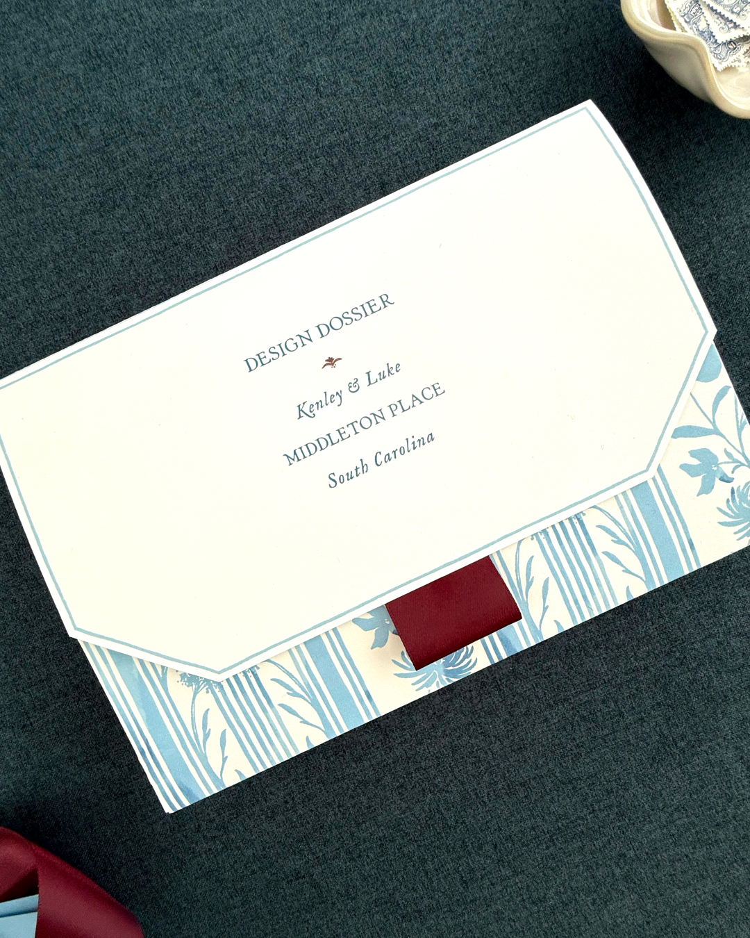
A cream-colored folder labeled “Design Dossier” with blue floral and striped borders and a maroon ribbon accent. The cover includes personalized names and venue details.
Previous
Previous

ZimmRose

Next
Next

The Aesthetishan