THE COMPANY
PROJECT
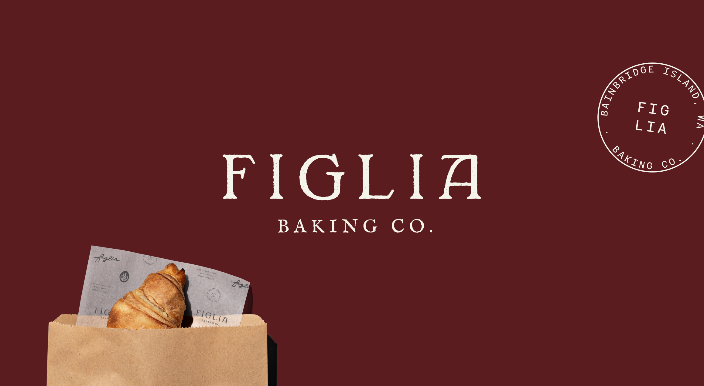
Figlia Baking Co. is an artisanal bakery rooted in slow fermentation, small‑batch craft, and a devotion to honest, European‑inspired technique. Every loaf, pastry, and paper‑wrapped bundle carries the warmth of heritage and the intentionality of true craft. By honoring time‑tested methods and infusing each bake with subtle moments of beauty, Figlia creates goods that feel both deeply soulful and quietly elevated. The kind you savor, share, and remember.
Brand Identity
Collateral
THE BRIEF
Our goal for this project was to design a brand that reflects Figlia Baking Co.’s baking philosophy rustic yet refined, artisanal yet approachable, classic yet modern. It’s a thoughtful balance where tradition and contemporary craft meet, much like the breads and pastries they create.
We achieved this by pairing imperfect, hand‑drawn elements with clean typography, warm textures, and a palette inspired by wheat, earth, and slow fermentation. The logo suite carries this sensibility throughout, blending delicate details with organic forms that feel lived‑in and handmade.
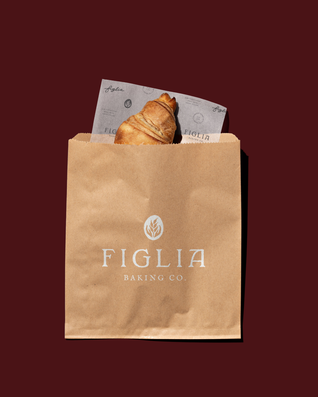
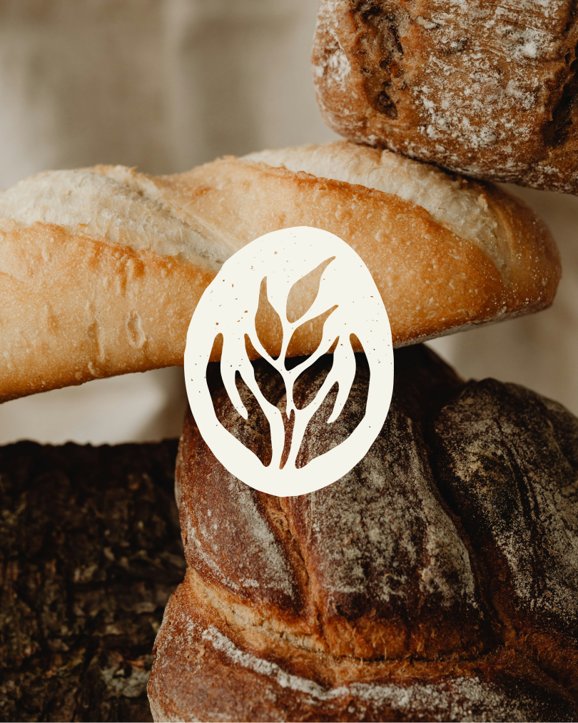
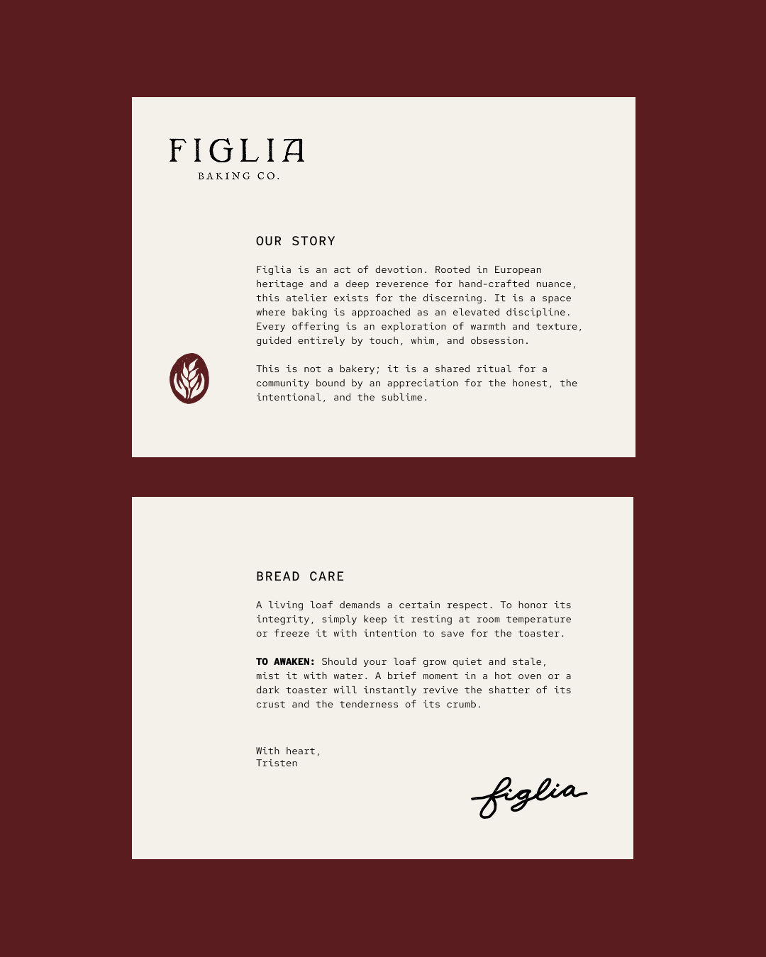
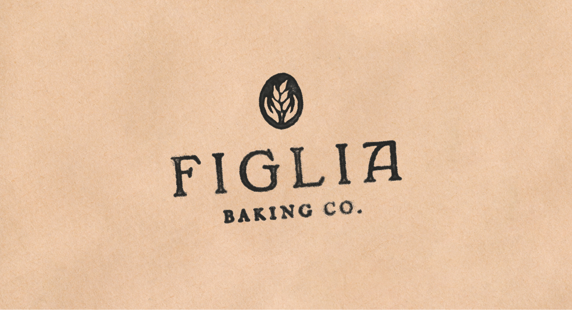
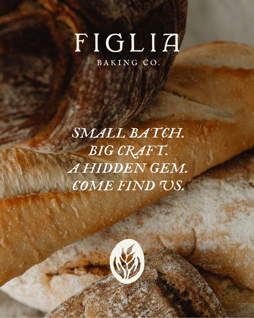
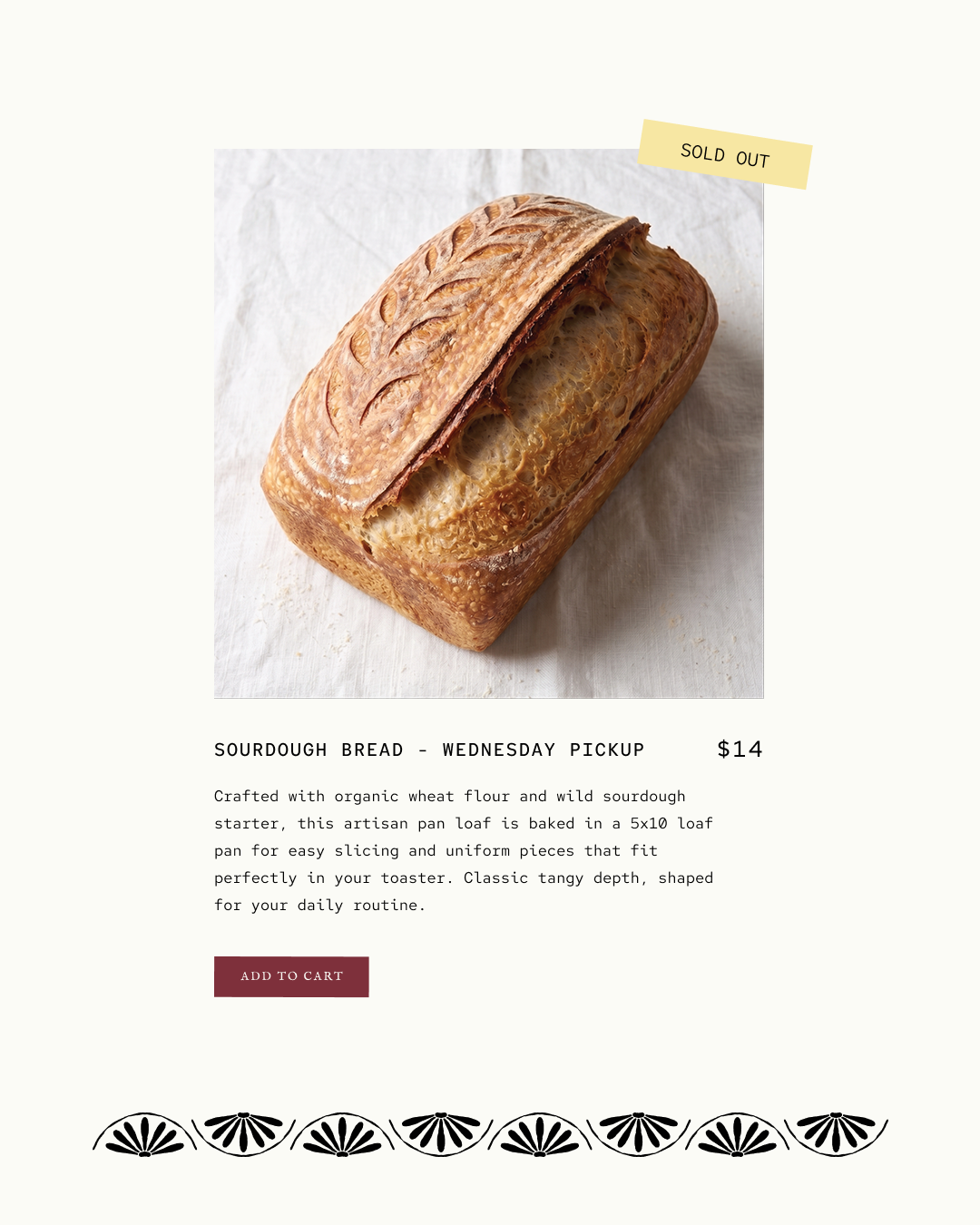
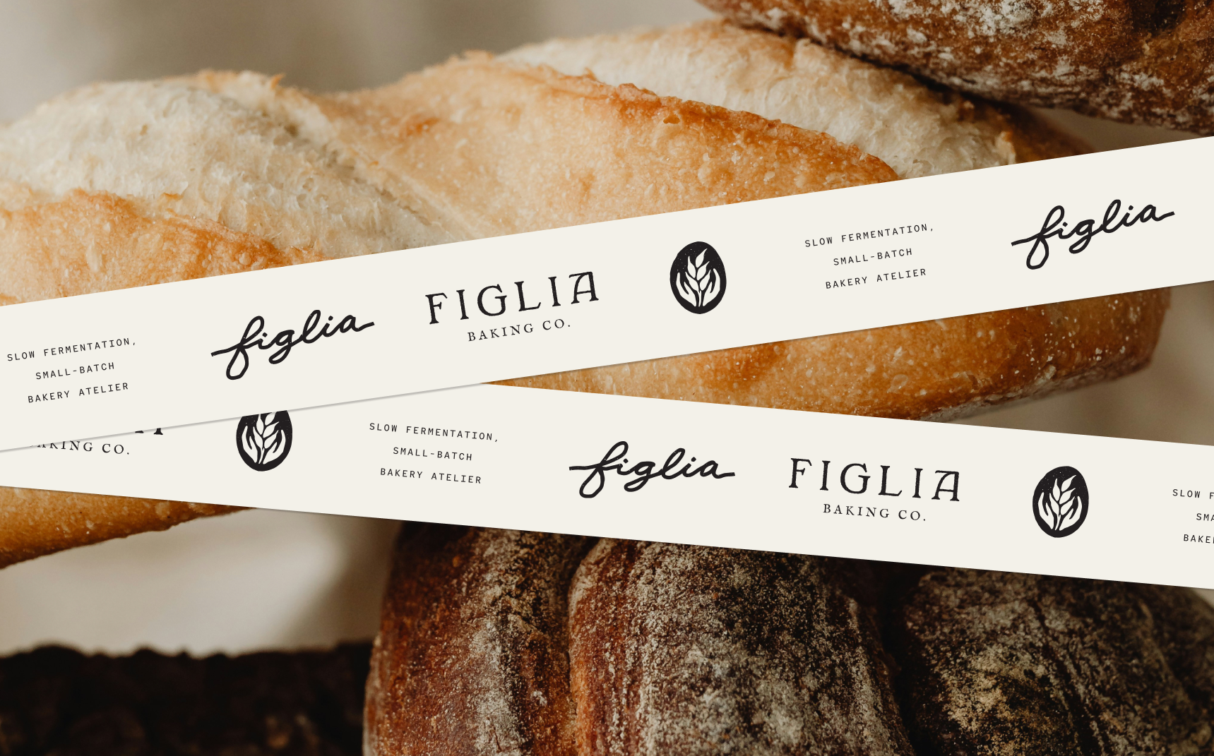
The Figlia Baking Co. brand extends its warm, artisanal identity across every touchpoint. We carried the brand’s handcrafted aesthetic through with organic textures, flour‑dusted surfaces, and a palette inspired by wheat, earth, and slow fermentation. Imperfect, hand‑drawn marks and subtle patterns add depth and tactility, reinforcing the bakery’s devotion to small batch craft. Each element, from the logo suite to the packaging, feels intentionally made and echoes the slow, thoughtful process behind every loaf. The result is a brand that feels intimate, grounded, and quietly elevated, mirroring the heritage‑driven baking philosophy at the heart of Figlia.