How to create a brand color palette that’s true to your business
Color is one of the most powerful tools in branding. It sets the tone for your brand, evokes emotion, and creates recognizability. A brand color palette does more than make your visuals look cohesive; it communicates your personality, values, and the experience you want your audience to have.
When I’m creating a brand color palette for a client, I always begin with the brand’s foundation: its values, purpose, and the emotional response we want the customer to have. It’s tempting to choose colors simply because they’re your personal favorites, but those may not be the best choice for your business. Instead, we look to color psychology and strategy for your brand.
[Related: Why Branding Matters for Your Small Business]
Why colors matter: the psychology behind your brand color palette
Most of our responses to colors are derived from nature and are innate. Colors naturally evoke feelings and associations for us. So when we’re creating a color palette for your brand, it’s important to consider color psychology and what different hues communicate:
Blue – Blues are generally soothing and tranquil, which often translates further to peace and trustworthiness. This is the reason blue is the most common color in branding, especially in healthcare and financial industries.
Green — Greens represent nature and growth, making green a common hue for health and wellness brands.
Red — Reds represent power and passion, and can create a sense of urgency or danger. Because of this, red can be a tricky color to incorporate into branding. Warmer and deeper reds can create a feeling of love and warmth, while brighter reds can enhance human metabolism, increase respiration rate, and even raise blood pressure. Believe it or not, red is actually the most commonly used color in fast food branding for this reason!
Yellow — Yellow is associated with joy, intellect and energy. It stimulates mental activity. Think of daylight and how we’re wired to respond to it–too bright a yellow or too much of it can be jarring.
Orange — As a combination of red and yellow, orange promotes rejuvenation and creativity.
Pink — Pink is typically associated with femininity, softness, youth or love.
Purple — Often associated with royalty, purple evokes luxury. Additionally, it can also convey creativity or mystery.
Brown — Brown is associated with strength, wisdom, and maturity. It has a sense of grounding to it.
White — White often conveys freshness, purity and hope, as well as creativity (think of a blank canvas).
Black — Black can signify elegance, mystery and authority. Because of this, it’s often used for luxury brands.
Each color carries emotional weight, so the goal is to choose tones that align with how you want your audience to feel when they interact with your brand.
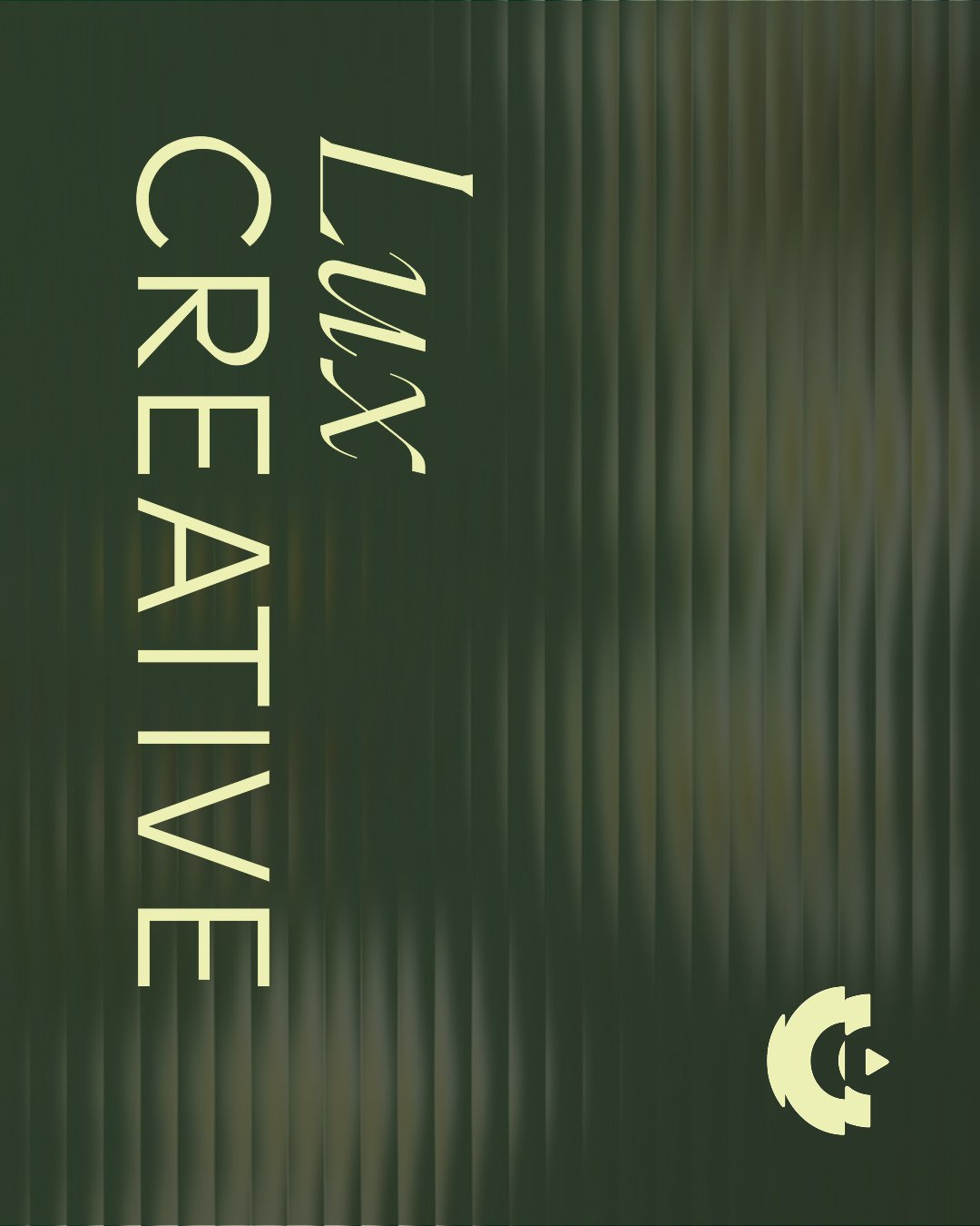
Lux Creative:
We wanted their brand to evoke feelings of: Optimism / Creativity / Positivity / Grounding / Abundance.
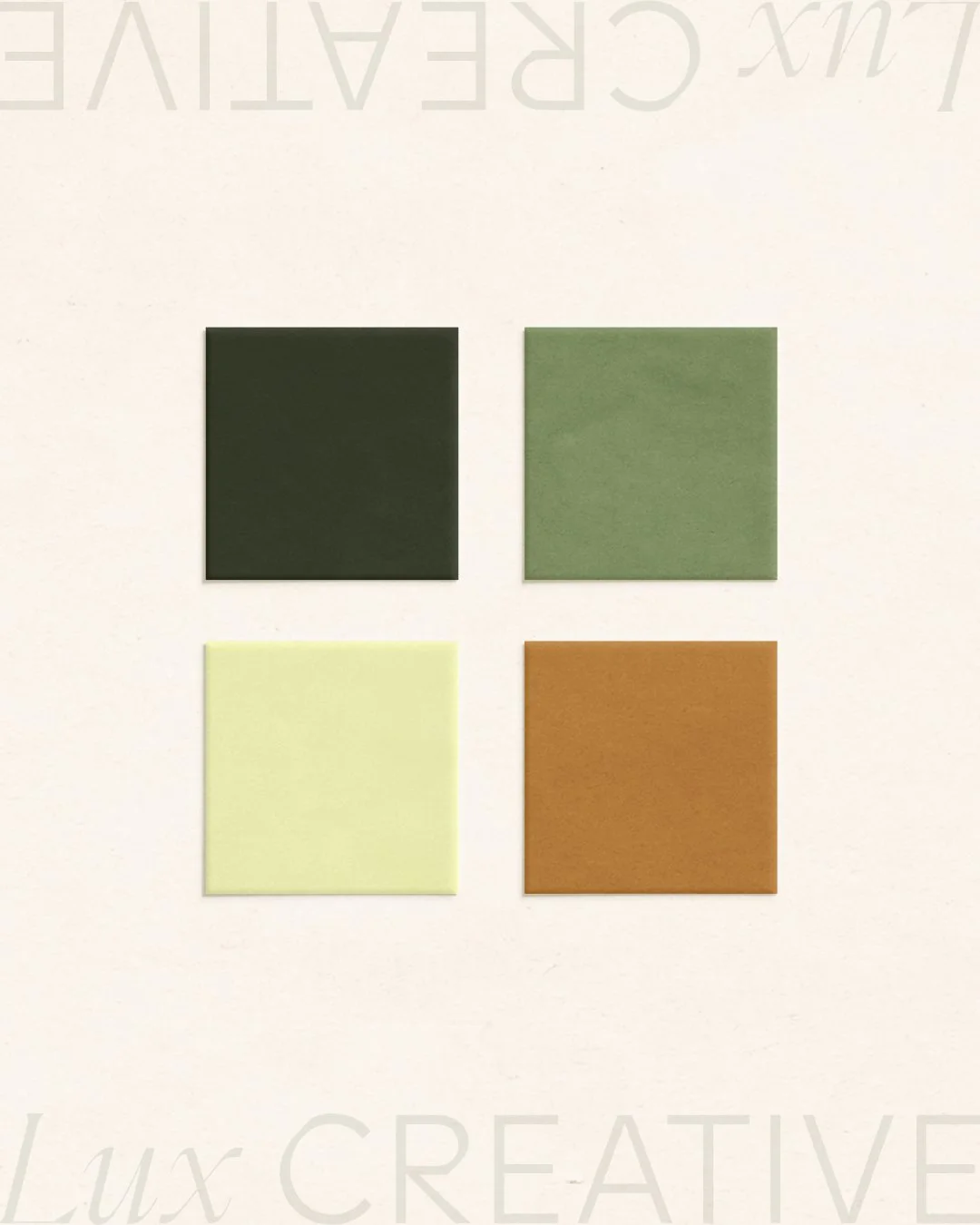


The components of an effective brand color palette
Brand color palettes typically consist of three to five colors total. When creating a palette for a client, I often start with two to three base colors, usually with at least one light and one dark color for contrast. From there, I’ll add at least one to three accent colors to complement the base and add personality to the brand.
The accent colors are usually bolder colors meant to be used for highlighting something or capturing the audience’s attention. For example, they’re often used for website buttons, sale announcements or advertisements. They could also be colors that capture some of the secondary brand values or personality that the client wants their business to be known for.
When creating a brand color palette, I also tailor the complexity of the palette to suit the business as best as possible. For instance, a solopreneur might only need a few colors for a website and marketing materials, while a product-based business with a robust catalog may need a broader range of hues to support packaging, photography, and seasonal variations.
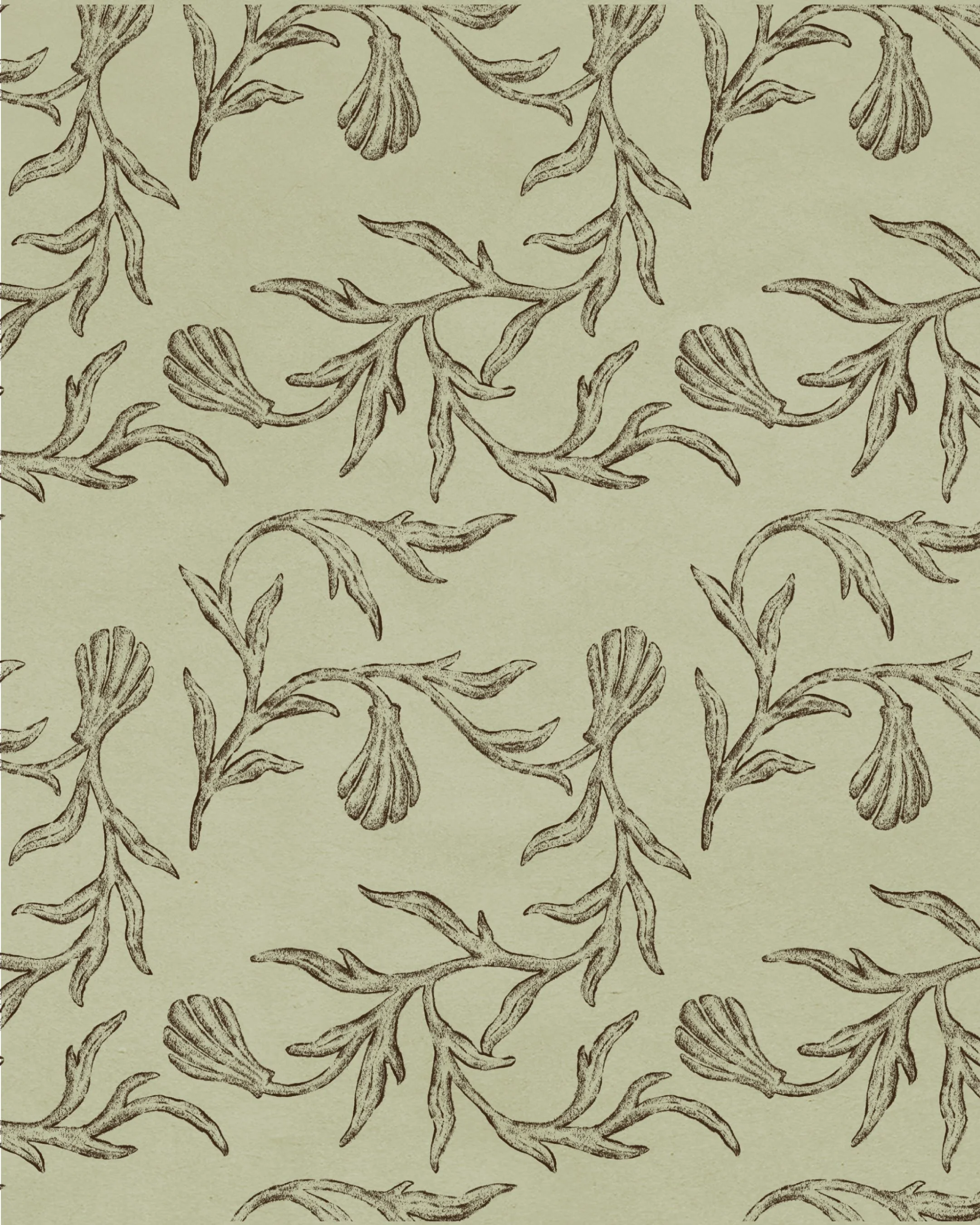
June Press:
We wanted their brand to evoke feelings of: Bespoke / Refined / Timeless / Heirloom / Organic / Coastal


Color palette strategies
Depending on the client, I may use different strategies when creating a color palette.
If the brand’s personality is fun or eclectic, I’ll opt for a broader palette full of various colors to let their personality shine.
Another strategy is to really commit to one or two colors and drench all touch-points in them. This makes a brand super recognizable; however, this strategy is best done with colors that are unique in the space.
Regardless of the approach, the key is that we’re building consistency. A thoughtfully crafted color palette gives your business a visual cohesion across every platform, from your website to packaging, social media to print materials, and more.
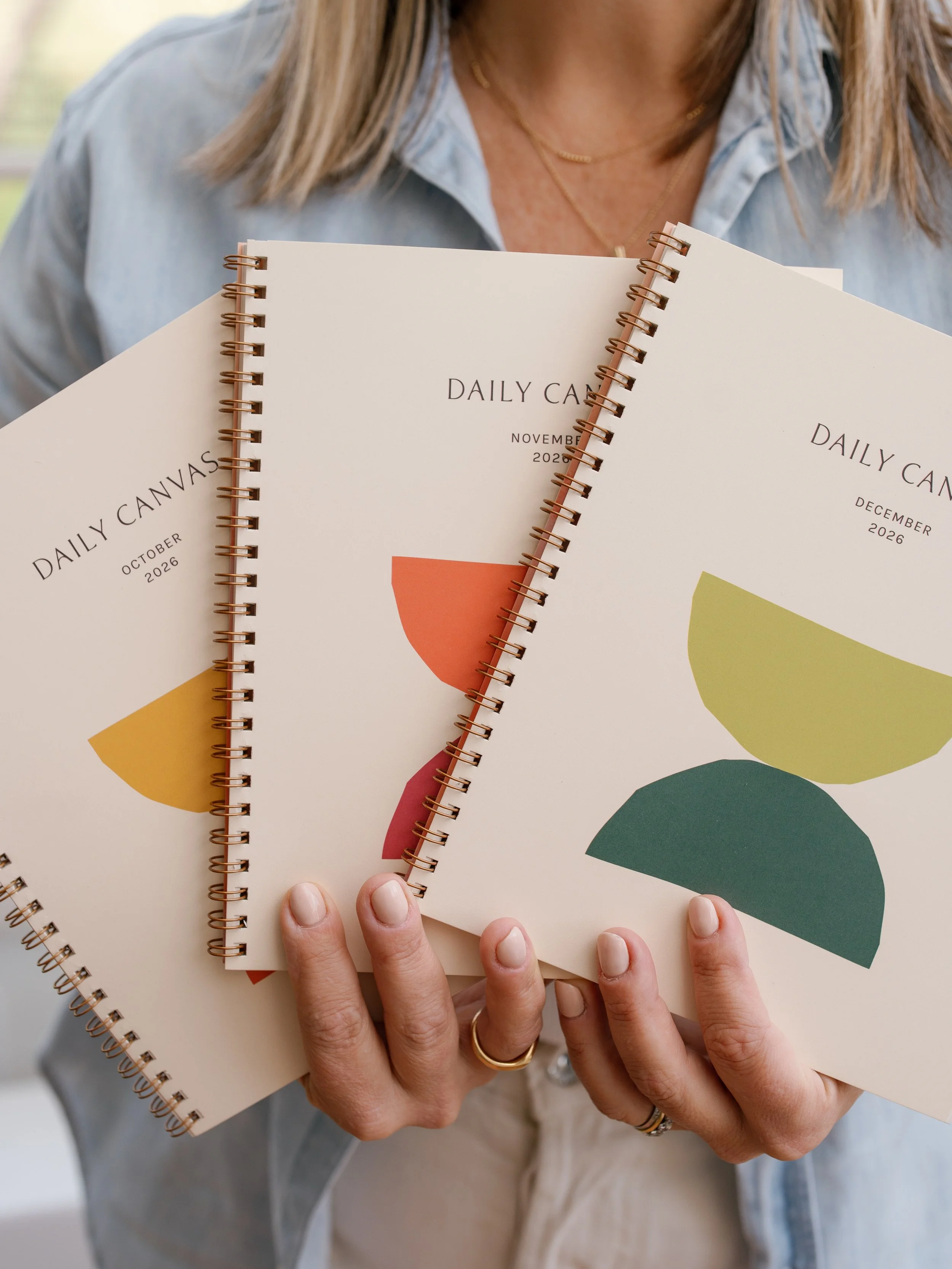
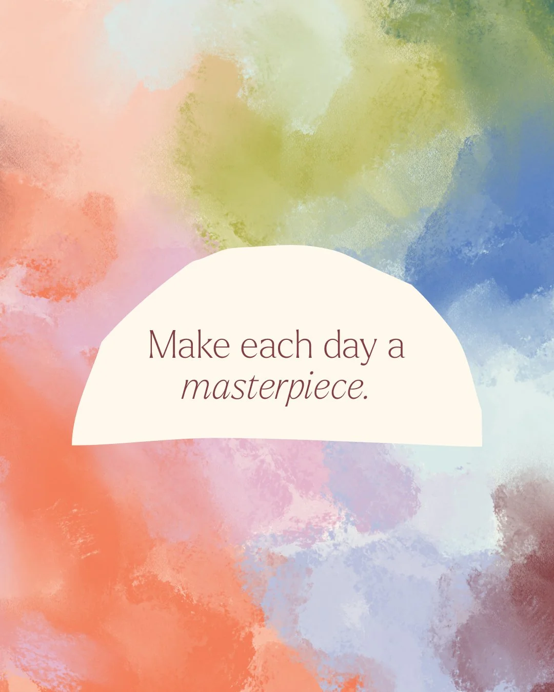
Daily Canvas:
We wanted their brand to evoke feelings of: Confident / Anchored / Prayerful / Aligned / Renewing / Modern / Feminine


Let’s dream in color
Your brand’s colors should do more than look aesthetically pleasing–they should tell your brand’s story, create an emotional connection that helps people remember you, and create cohesion in your branding.
If you’re feeling stuck trying to figure out the best colors to use for your brand, reach out and let’s chat! I love helping business owners craft artisanal branding that creates a lasting impact.