Exploring textural design trends
As a designer, I prefer not to lean into trends too heavily. Instead, I like to strike a balance of staying relevant and current while ensuring that my clients’ designs have longevity. I tend to stay away from styles that are so trendy that they’ll feel outdated in a year or two. My goal is to aim for a level of timelessness with each project. That’s why I’ve been thinking a lot about what people are calling the “textured grains design trend” that’s been gaining momentum in 2025. It actually doesn’t feel like a passing fad to me.
Texture, tactility, and analog-inspired design have been part of my work for years. They’ve also been foundational to visual communication long before tech, and long before becoming graphic design elements.
So while this aesthetic may be having a moment, I think this is a reflection of our appreciation for timeless design and personal experiences.
Why textural design trends are gaining popularity
First, what do we mean by “textural design?”
This design style is about incorporating elements that feel handmade, tactile, and analog. Think grainy overlays, hand-drawn illustrations, vintage elements, textures, and imperfect, gritty finishes. These details create a sense of warmth and nostalgia, and they stand in stark contrast to the super-techy world we’re living in, especially with the rise of AI.
I think that’s part of why we’re seeing this style resonate so strongly right now. People really treasure authenticity and enjoy being transported to a time that was more tactile and sensory.
How I incorporate texture into my designs
I’ve always been inspired by tactile qualities and analog visual elements, but over the past year or two I’ve really embraced my own artistic growth and our collective appreciation of texture in design. This creates a stronger emotional connection in the work I create for my clients.
Here are some of the ways I’ve brought texture and tactile qualities to some recent projects:
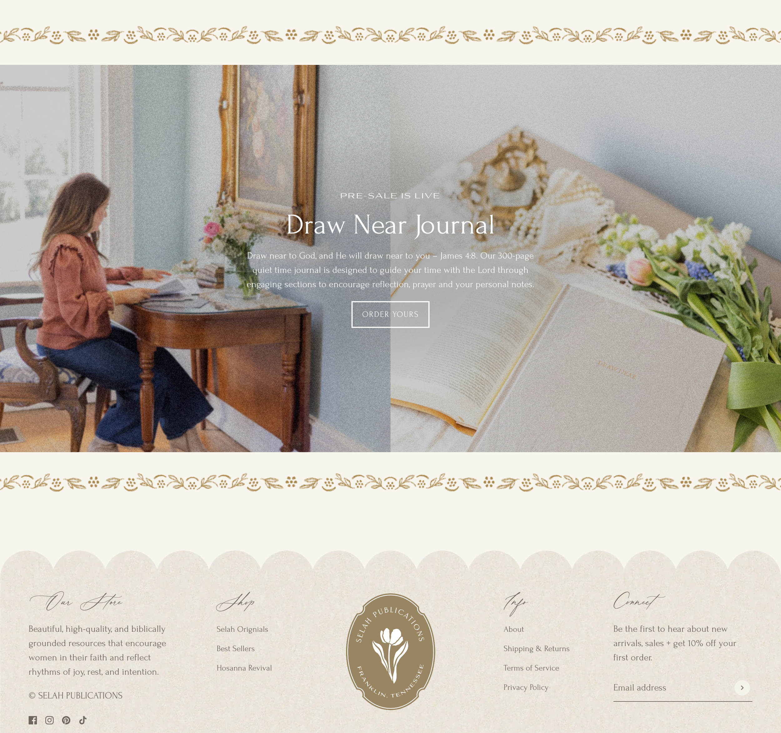
Paper texture for Selah Publications
I added a paper texture to fill the scalloped border elements and incorporated hand-drawn illustrations throughout Selah Publications’ new website. I also added some “noise”–a grain texture that reads like old film–to certain photos to bring a nostalgic feeling to the site.
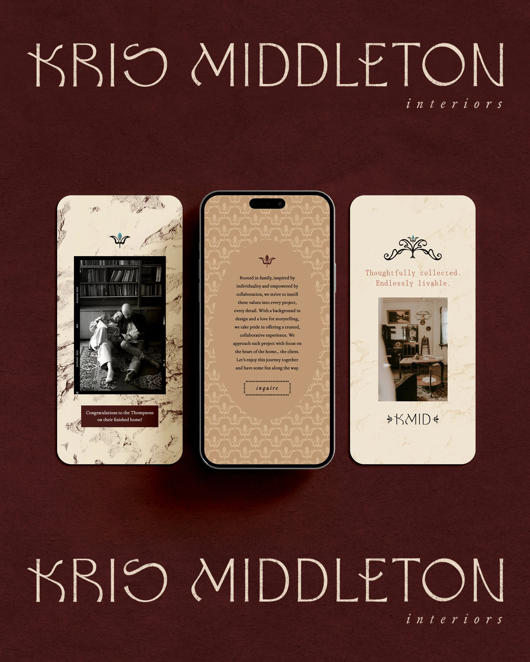
Worn-in texture for Kris Middleton Interiors
I recently finished a brand and website design project for Kris Middleton Interiors, and we incorporated loads of texture and different analog-inspired techniques throughout her brand design and website.
I created all of her brand assets with a worn-in texture to them, versus a flat color fill that we can often default to. In college, I was taught that the only acceptable way to create a logo was to have it be a flat-filled vector. Well…sometimes rules are meant to be broken! We have the vector versions too if we need them, but her interior design style is vintage meets modern, and she embraces collected spaces and unique vintage finds, so I knew we had to create a brand that reflects this. (She actually already used the vector files to create custom embroidered cocktail napkins for her brand launch party–how cool is that?!)
We also have paper texture backgrounds throughout her website, and integrated vintage photo film frames to use on key photography throughout her brand touch points. This all brings a sense of nostalgia for analog details and times gone by.
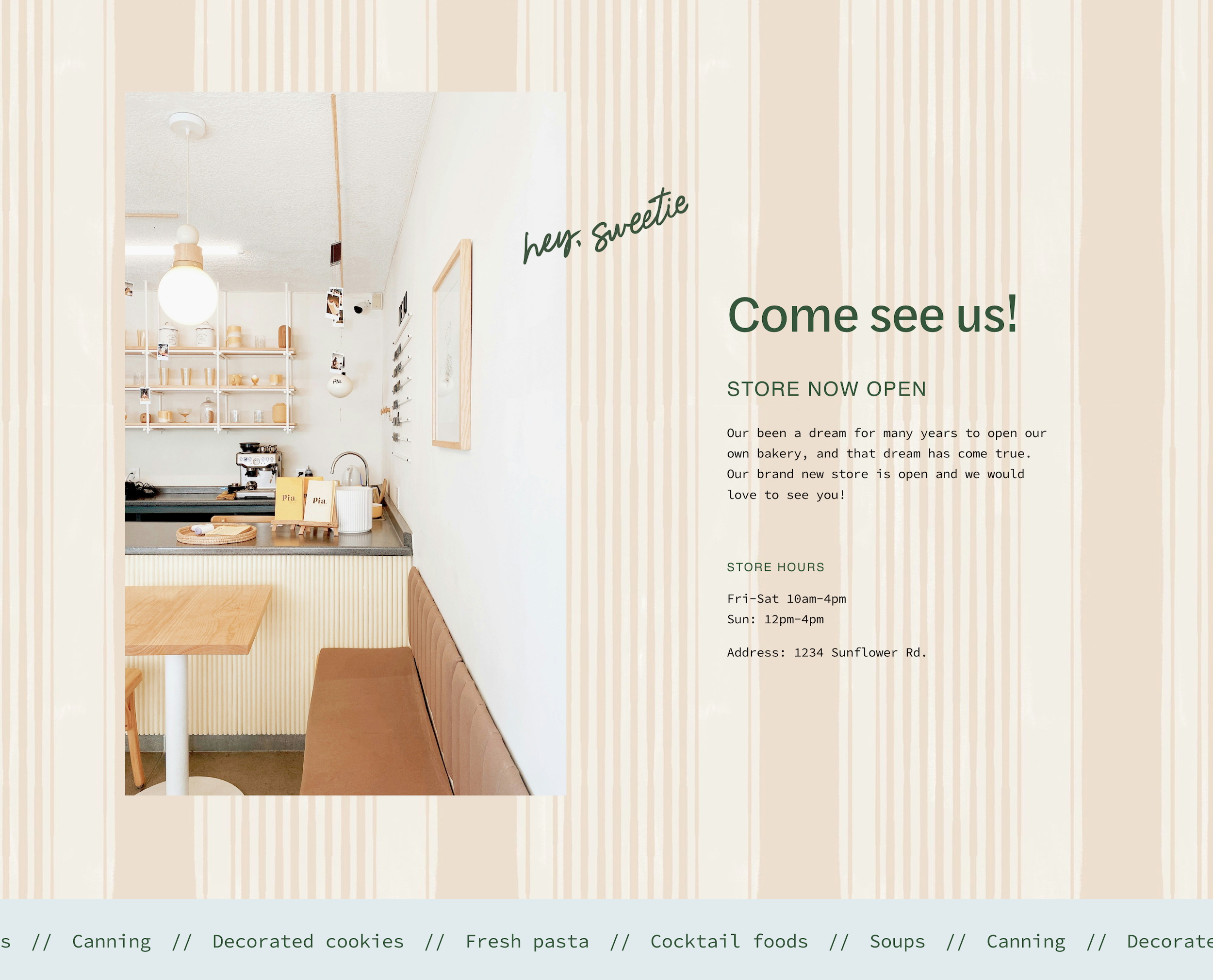
Hand-drawn patterns & type for Ruby Ru
I love creating brand patterns and textures on my iPad to make the work look like it’s painted or drawn on paper. There are endless brush options to create watercolor effects, toothy pen textures, pencil effects, and more. I have a few go-tos that I love to use for many of my clients.
Ruby Ru is a great example that incorporates a few hand-drawn patterns and hand-lettered elements that we used for this client’s custom food packaging and for the brick-and-mortar bakery opening later this year. We’re also using them on the website, which will launch soon!
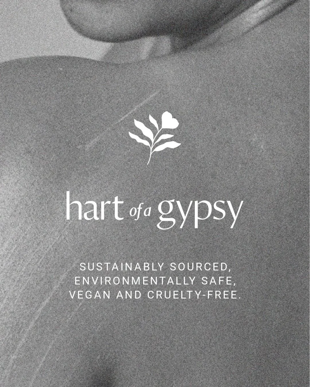
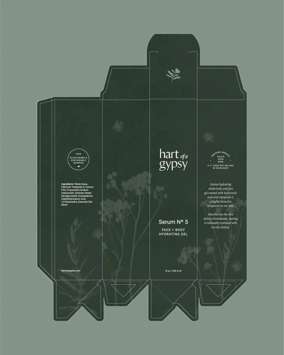
Sun prints for Heart of a Gypsy
This has to be one of my favorites so far. I went way outside of typical digital art with this project and made sun prints (also called cyanotypes) for Hart of a Gypsy’s body care line. Their ingredients are plant-based and all-natural, so I looked straight to nature to design their brand identity.
I made a sun print using some of the plants in their formulas and colorized it to their brand colors. We then used it across many brand touch points, including packaging and digital marketing materials. Their packaging and branding are now made of one-of-a-kind art! You can watch the whole process in this reel I recently shared.
Hand-crafted, timeless brand design
I don’t believe texture in design is about following a trend. It’s about evoking feeling and connection for your audience. Even if this particular style is “on trend” right now, to me it’s something that is timeless and will endure.
If you’re drawn to texture, warmth, and tactile design that tells a story, I’d love to collaborate! You can see more examples of my work in my portfolio, and if you’re ready to get started, simply reach out here.

