

THE COMPANY
PROJECT
The Ginger's Garden is a pop-up plant shop with a big heart. The business' mission is to create community and support other local small businesses.
Brand Identity, Print,
Social Media Direction
THE BRIEF
Create fun and earthy branding that is centered around “community” as a primary focal point of the brand.
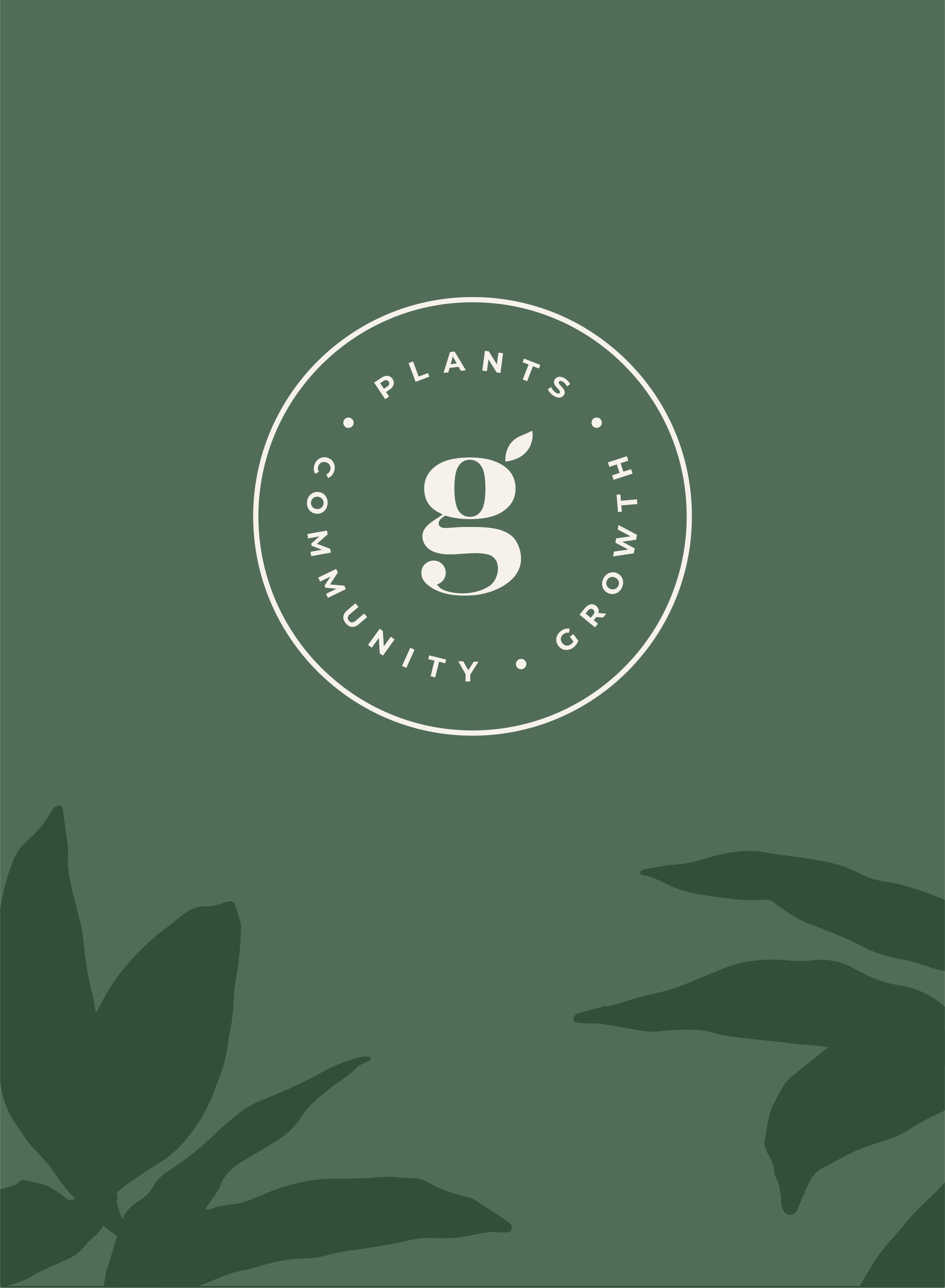


The Ginger's Garden offers an assortment of plants, pots and other handmade, local goods. The brand identity was designed to reflect this eclectic, earthy, and playful soul. The logo utilizes a typeface that's a little vintage, a little contemporary and a little organic. Circles are a recurring theme throughout the submarks, as they represent the ideal of community and "one-ness" that this business holds so dear.


To round out the identity, I drew abstract plant illustrations that feel like a mix of vintage and contemporary. I also developed an earthy color palette featuring bold terracotta hues to complement rich greens and soft neutrals. And we took a more humanist + educational approach to photography, which features more imagery associated with the plant education aspect that is so important to The Ginger's Garden.