THE COMPANY
PROJECT
Kris Middleton Interiors designs homes that feel both deeply personal and effortlessly elevated throughout the Dallas–Fort Worth area. By weaving her clients’ stories into each design and layering in unexpected moments of intrigue, Kris transforms spaces into timeless reflections of the people who live in them.
Brand Identity
Collateral
Website Design
THE BRIEF
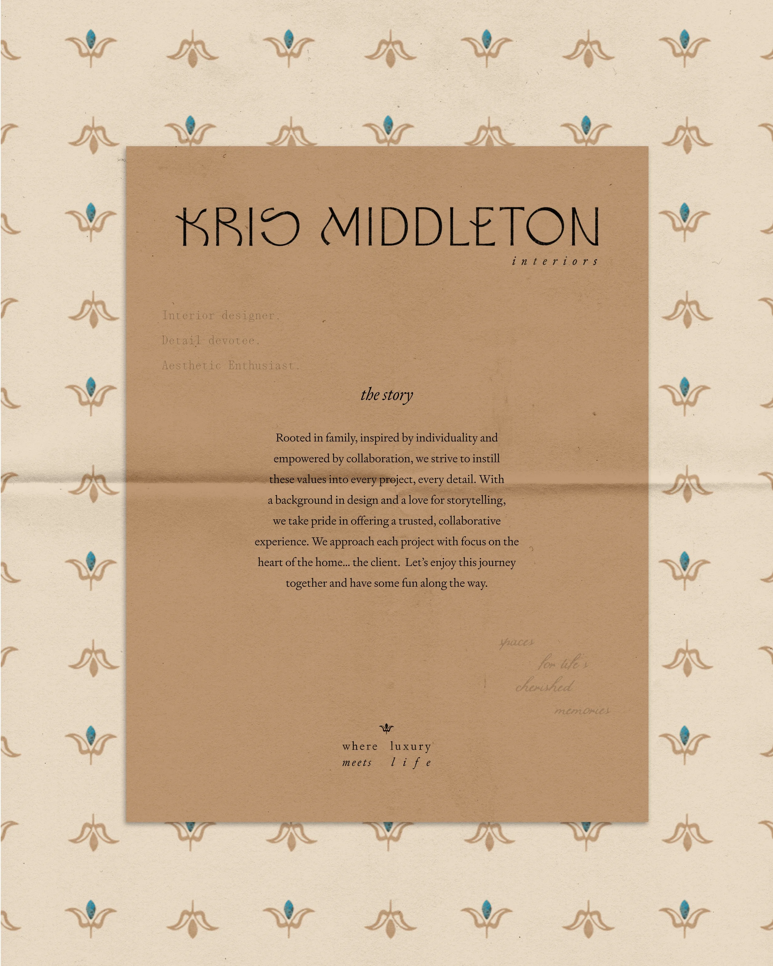
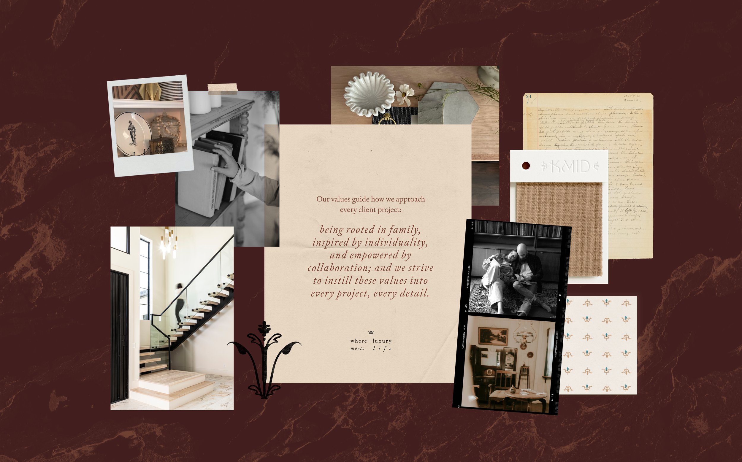
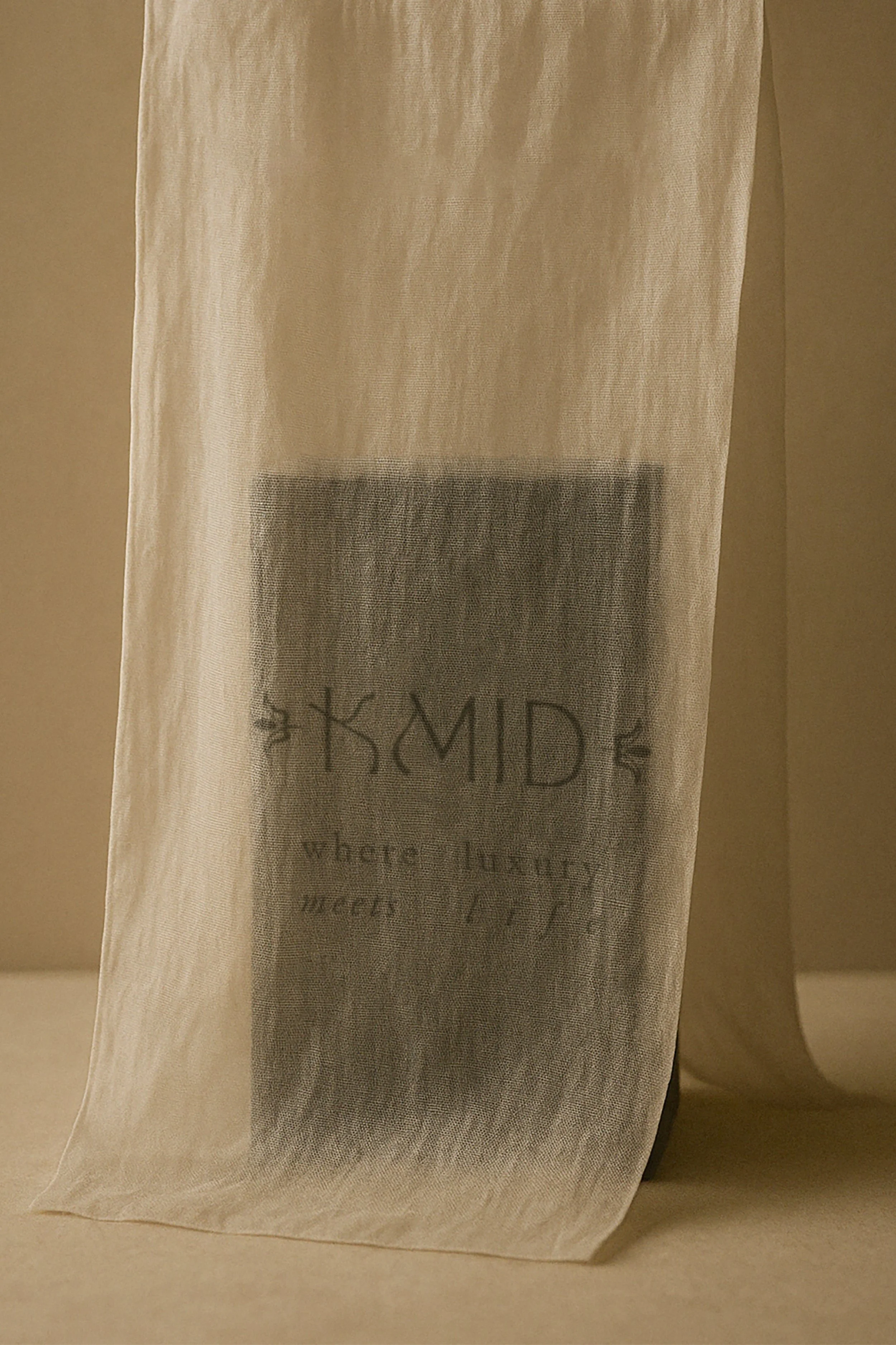
Our goal for this project was to design a brand that mirrors Kris Middleton’s interior design philosophy—collected yet refined, elevated yet approachable, classic yet modern. It’s a thoughtful balance where contrasting styles come together in harmony, much like the homes she creates. We achieved this by pairing unexpected fonts, textures, and colors that feel simultaneously vintage and modern. Her logo suite carries this sensibility forward, combining delicate details with organic, imperfect forms. And the turquoise stone, subtly scattered throughout, adds a touch of surprise—quiet yet striking, leaving a signature impression wherever it appears.
The centerpiece of this brand identity is the fully custom logotype. We needed the logo to convey a lot of emotion and meaning in one little mark. It needed to be avant garde to appeal to their eclectic client base, yet sophisticated and also approachable. They wanted something unexpected. We started with base fonts as inspiration, but nothing quite met the mark so we ended up crafting each letter by hand through many iterations of refinement (below is only a small fraction of the exploration that went into this logo!), and ultimately hand-writing the word “you” to get that truly one-of-a-kind feeling behind it.


